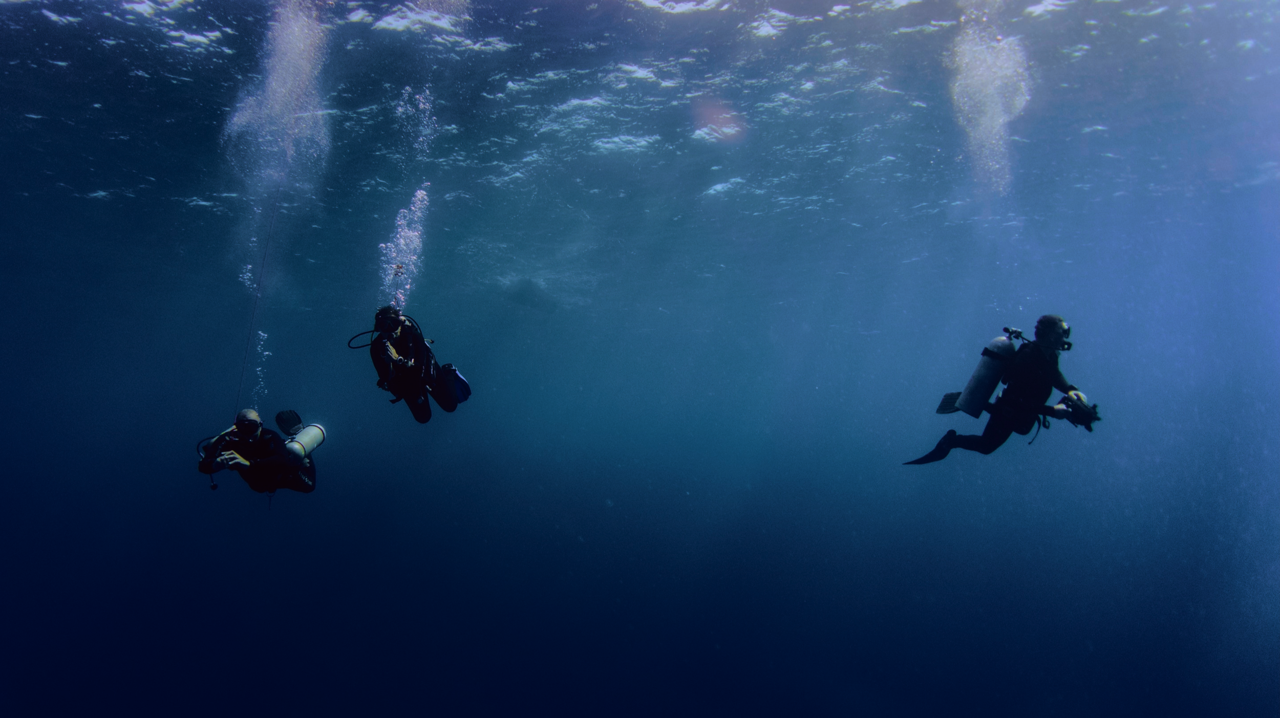
Nero-Sport Diving centre
SCOPE
Research and redesign of a website for a dive shop located in Greece, Zakynthos
PROCESS
User research and persona creation
Information architecture
Branding
UX/UI design
Prototyping and User testing
Iteration
FOCUS
Responsive web design, Branding, Business & User goals balance, Customer journey mapping, and Strategic thinking
ROLE
Ux researcher and UX/UI designer


Research findings summary
Secondary research
The most active visitors of a diving centre website are usually amateur divers, professional divers, and people who want to learn scuba diving. The site may also get a share of other visitors who likely love to travel, sports, or lead an active lifestyle. On average, dive centre demographics are usually male age 20 to 45 years old.
Visitors of a dive centre website generally want to find out about the courses being offered, duration, requirements, dive locations, and corresponding fees.
These websites rarely have repeat customers. Must consistently “recruit” new dive-clients, competing against all other dive resorts in the area. Therefore need a large marketing budget and good advertising.
Competitive analysis
Despite from deals, good value and acceptable prices not one of the researched companies pursue strategies such as, for instance, cheaper prices for time-limited double dives. That is very good, as it is a dangerous sport that must be treated seriously and professionally.
Personal contact and approach are very important to all. Online chat, contact info are always available.
Most show growing concerns and interest in the environment.
All sites have wonderful photography, all present collaboration with professional training organizations like PADI, CMAS, etc.
View full research findings document here
Survey findings
When asked about suggestions and improvements, all respondents mentioned that finding a way to arrange a dive trip was difficult and they would prefer to have a phone number within reach or a simpler enquiry process.
I put some of their thoughts in an empathy map to help define the users pain points

Define
After identifying the key users of the app characteristics, their main goals and current pain points, I listed priorities and features for the product roadmap - a list of features based on my user research conclusions, the business’ needs, the persona, and the market analysis.
Digitalized the sketches into low-fidelity wireframes


Prototype & Test
Please press ‘Options’ (in the top right corner) - ‘Scale down to fit’ for better interaction with the prototype
Usability testing results summary
I conducted remote usability testing to discover what were the inconveniences for the users. Two users out of 17 didn’t notice the navigation bar and said they had to scroll through the page to find what they needed. One user mentioned they didn’t notice an easy way of looking through the dive sites.
I created an Affinity Map, Prioritisation Matrix and made priority revisions and iterations (please see the screens below) .
Primarily, I revised Accessibility, added a way to access all the dive sites, added a Filter to sort Dive sites by the level of difficulty, location, and type of dive to make things easier to navigate.
Main Users’ needs and pain points were addressed and user testing went successfully.

Reflection
As the purpose of the Dive website is more informational, rather than the booking itself, we most importantly want the user to be able to find and read the data they need. According to user research the following information details were found equally important: the ability to Contact the Centre, Team qualifications, Dive sites and locations, Prices and offers, Opportunity to receive one of the world-known diving certifications and get a license. All of these items are listed with CTA’s below the main call to action on the hero image - “Dive deeper” with a chevron pointing down.
The current website has abundance of information. For the redesign it was from re-worded, re-organized, parts that users are looking for were highlighted.
One of the interesting parts was re-designing a logo, as I had to keep it within the rebranding style, but also keep it similar to the old logo both for recognition and because it was very dear to the owners.
One of the most pleasant parts of user testing was that all of the respondents noted that the style of the homepage got them curious to want to keep going till the very end of the page. Information hierarchy was clear, the UI felt inviting and it was easy to locate the information.


