Store queuing system
Improving check-in and waiting experience
SCOPE
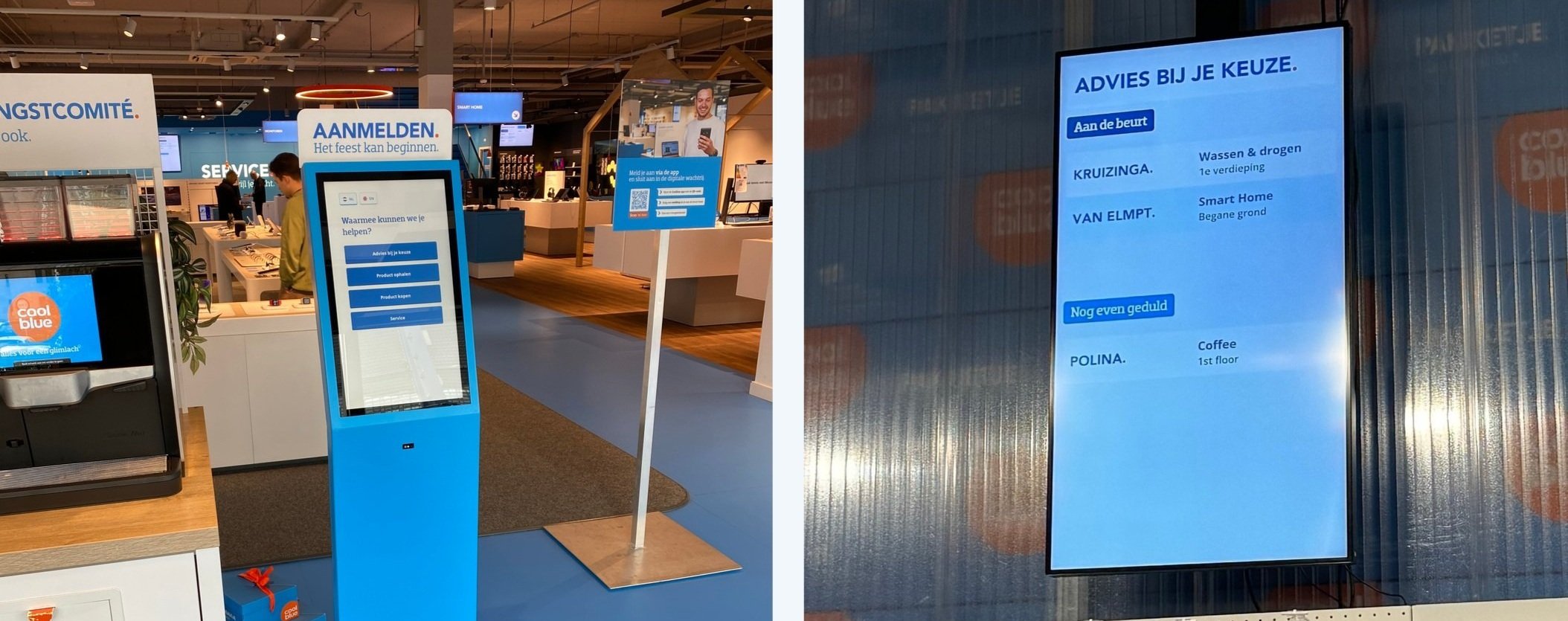
This application was designed to provide clear, real-time information to customers about their waiting time and position in the queue, where and who will meet and help them.
Devices include: 1. Check-in kiosks; 2. Waiting screens; 3. Internal employee queue management application.
In this case study, I will focus on the check-in kiosk.
PROCESS
UX Research
Information architecture
UX/UI Design
Customer Journey mapping
Prototyping
User Testing
Iteration
ROLE
UX researcher
Interaction Designer
Workshop facilitator Information Architect
OUTCOME
Achieved a +1 YoY increase in Service NPS, with ongoing improvements in customer wait time clarity and overall interaction quality

Turning confusion into clarity:
understanding the problem and setting clear goals
Problem:
Providing helpful, friendly, and personalized advice to customers is a core part of Coolblue’s identity and strategy. Coolblue stores excel in offering face-to-face advice, resulting in higher conversion rates and customer satisfaction. However, the queuing system didn’t seem to be as friendly and user-centric, as the rest of the experience.
Problem statement:
Hypothesis:
So if we
Customers are confused by tickets labeled only with numbers, and the waiting screen only shows information about those already served, leaving others uncertain of their wait time or place in the queue. Additionally, the small check-in screen is often missed, resulting in poorly distributed queues, lower NPS scores, and inaccurate store data.
We wanted to improve this by managing customer expectations in a clearer, more personal way. After extensive research and numerous conversations with queue management suppliers, we found that none of the available options fully met our needs. So, we decided to build our own solution, and Quincy [the Queueing app] was born.
We believe that
Then we will see
Goals:
…implementing a personalized check-in kiosk and real-time queue updates will enhance the customer waiting experience.
…provide easy visit reason flow, clear, real-time updates and personalized interactions,
…higher store NPS, increased in-store spending, and improved employee satisfaction and performance.
Goals:
Improve customer satisfaction through a more efficient service.
Increase sales by encouraging in-store browsing
Streamlined customer check-in process.
Clear, real-time updates on queue status.
Increase visibility and usability compared to the old solution.
Aligning Vision
At the start of the project we realized the need to come up with Quincy’s vision to ensure alignment, using it as a reference for all technical and design decisions.
“Quincy guides, supports and manages the visitor and employee in the most personal, efficient and user-friendly way, while providing insights to Coolblue to improve EBITDA and NPS.”

Research methods

Market research
Unleashing Creativity:
Opportunity mapping and Design Thinking for innovative solutions
Opportunity solution tree
During the Product discovery phase, to ensure there is an outcome-focused approach across the entire team, we used the Opportunity solution tree.
We managed to spot a lot of opportunities and solutions.
(click to open in a new window and enlarge)
Design Thinking and brainstorm workshop
Regardless of what problem you tackle, it’s good to apply some basics from the Design Thinking methodology.
To address the project's challenges effectively, I facilitated Design Thinking and brainstorming workshop with a diverse team, including designers, developers, a customer journey specialist, a PO, and process improvers.
It’s good to encourage the team to adopt a divergent mindset. Divergent thinking is a creative, non-linear, free-flowing approach that deliberately ignores potential constraints and limitations to generate a wide range of possible solutions. All ideas are welcome, and none will be questioned or dismissed.
We started by clearly describing and defining the problem, including the specific outcomes I aimed to influence.
Next, we tried to look at it from as many different perspectives as possible.
The best way to achieve this is by assembling a multi-disciplinary team with diverse backgrounds to collectively discuss and come up with the best ideas.
GOALS
Explore the problem from multiple perspectives.
Generate a wide range of potential solutions through a divergent mindset.
SCOPE
Collaboratively discuss and refine ideas.
Apply creative, non-linear thinking to overcome constraints.
RESULTS
Identified a comprehensive range of potential solutions.
Provided a strong foundation for the design phase.
From concept to reality
The Design Thinking workshop gave me an idea of all potential solutions and was a great and strong foundation for me to start working on the design.
Initial Sketches & Design Concepts

Some of the low fidelity and high fidelity wireframes
The designs we ultimately tested (see testing methods and results below)

Usability Testing & Design Iterations
Usability testing helped me and the team to:
Validate design choices: it provided real user feedback to refine and enhance the design for better usability.
Identify challenges: it highlighted specific areas where users struggled, leading to targeted improvements.
Improve User Experience: we ensured that the final designs were intuitive and met user needs effectively.

Overcoming design challenges identified in usability testing
AFFORDANCES
Everything about the user experience is exaggerated at the large size — the beauty and the fun, as well as the effort and the frustration. Attempting to use touch on apps that are were not designed for touch is boring at the least and frustrating at most. So we brought effort into Making clickable elements recognizable, Affordances - meaning creating elements that users know what they should do with, without any instructions. Keeping in mind that people who come to the store don't want to waste their time and value efficiency even more so than on the website at home.
SPACE
You would think large displays offer plenty of screen real estate for interface controls, so it would be easy to fit controls into the interface. However, since UI elements need to be larger to be seen and interacted with on a large screen, a big screen can fill up surprisingly quickly. Therefore a very large touchscreen design suffers the same threat of being over filled that smaller screens do.
CONTENT
In research on how people read websites they found that 79 percent of users always scanned (not READ) any new page they came across; only 16 percent read word-by-word. The eyetracking research reveals that page density largely accounts for how people look at web pages. In other words, good content and less cluttered pages engage people more than cluttered pages do.
It doesn't seem right at first, but actually interface controls would be harder to find on a large screen. So the challenge with large screens was to make interface elements noticeable, without being obnoxious.

Priority revisions
After conducting usability testing we made some priority revisions to the kiosk’s designs.
On the cards below, I included UX and user psychology insights next to the components to explain some of the design decisions.
(Click to open in a new window)Building a cohesive Design System
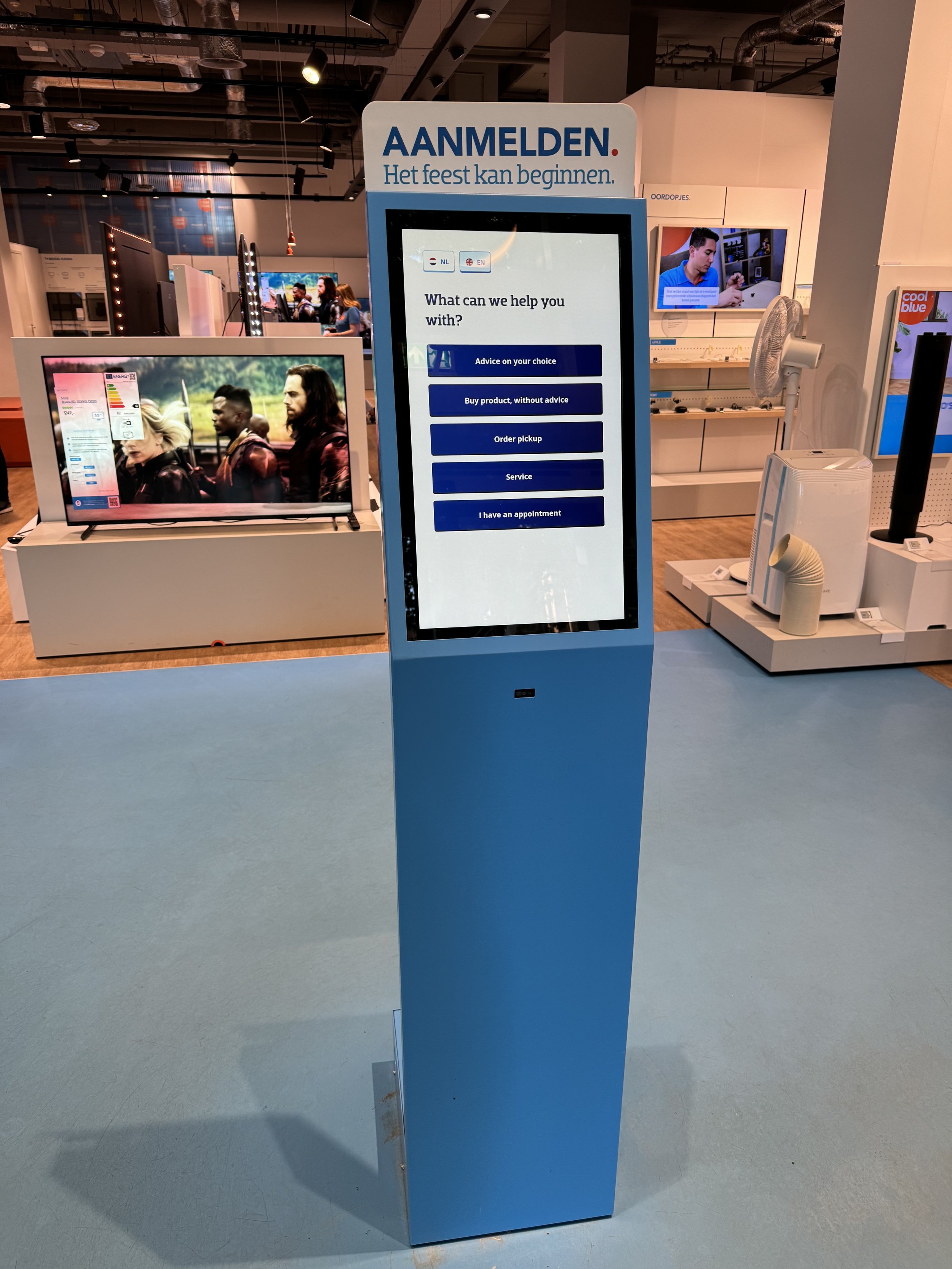
The new 21.5" (54.5 cm) touch screens introduced a novel application, giving our team the autonomy to develop a new design system and component library from scratch. This included:
Guidelines and Components: Developing consistent guidelines and reusable components to ensure a cohesive and scalable design.
Brand Alignment: Conducting extensive research on Coolblue's existing front office design system to maintain brand coherence and user familiarity.
We crafted an experience consistent with Coolblue's style and branding while adhering to the existing webshop's design system. However, this needed to translate not only from desktop to touch, but also from the comfort of a home computer screen to the in-store environment, where customers might feel rushed or uncomfortable. Thus, design choices had to be exceptionally clear to ensure the environment remained familiar and user-friendly.

Final designs
Choosing the visit reason
Coming to pick up my online order
Results & Testimonials:
+1 YoY service NPS, growing improvements & wait times
(click to enlarge)
Next steps:
Of course not all the reviews are good. There’s still room for improvement. For instance, the kiosk's QR code scanner strip under the screen sometimes confuses customers - after implementing final designs we observed some people who, after finishing the flow, extend their arms, expecting a ticket. Some users type in their full name, while others prefer not to check in at all.
Some of the potential next steps are:
Clear Labeling and Instructions: Add clear labels and on-screen instructions to better explain to the users the value and the purpose of the product.
Visual and Audio Cues: Implement visual cues, like animations or lights around the scanner, and audio prompts to guide customers through the process.
Simplified Check-In Process: Streamline the check-in process to reduce the need for typing and reading and make it more user-friendly.
User Feedback Collection: Continuously collect and analyze user feedback to identify recurring issues and areas for improvement.
Reflection
🤲🏼 Use nudges carefully. They could cause the exact opposite reaction.
Users are less likely to adopt a behavior when they feel forced. Reactance occurs when a person feels that someone or something is pushing them. It'll trigger an opposite response to what was intended, and also increases resistance to persuasion. Reading all the negative reviews about situations when customers didn’t see any value in registering, but still were recommended to do so proves just that.
Remember there’s a person behind every screen, not just a point of data, and make it possible to make an exception and leave the flow.
👀 Hawthorne Effect
Users change their behaviour when they know they are being observed. I frequented going to the stores to observe my users, but often what they said they wanted didn’t match what they actually needed or what would improve usability. When we observed customers quietly, they made fewer mistakes compared to usability tests, when we asked them to think outloud. It seemed that sometimes they didn't read a screen properly because they were either distracted by our presence or felt rushed. That’s when getting data from an analytics platform became really helpful. Seeing things like rage clicks or frequent use of the back button, without them knowing, gave me some real insights into their natural behaviour.
This also brings me to the next point:
🎁 Designers should … always bring the chocolate
Don't just do what people ask for; go beyond that and deliver something they didn't even know they wanted. It's incredibly rewarding to read all the positive reviews we get about Quincy. I believe this project aligns perfectly with Coolblue's brand identity, and people truly appreciate being addressed by their names. It's a reminder that thoughtful, user-centric design can create delightful and memorable experiences.
One of the greatest joys of using technology comes through user empowerment and engagement. An enjoyable experience means more than just usability — it needs to be engaging. A good example of it are microinteractions, that can improve a product’s user experience by not just giving feedback and displaying system status, but also encouraging engagement and communicating your brand.
🇩🇪 German fail and importance of cross-cultural design
Dutch social psychologist Geert Hofstede identified six aspects of cultural differences in his Cultural Dimensions Theory. When we started implementing Quincy in Germany, it was easy to assume that two neighboring countries are culturally similar - and in many ways that’s true. But when it comes to cross-cultural user experience design, understanding the differences between cultures is essential in making an acceptable product. After seeing low conversion rates and overall low NPS scores for German stores we discovered Germany’s high score on the uncertainty avoidance dimension. Germans prefer not to share their personal data, even pay mostly in cash. This mistake could’ve been avoided, and we certainly learned the lesson.


